Sunday, August 30, 2009

Scrap Challenge Card #1

Lately, I've been making cards that generate scraps rather than use them. The result is this:


My Cropper Hopper accordion folder is perfect for organizing scraps. Unfortunately, it barely closes at the moment because it is full and fat, even though I'm not a hoarder of small scraps. Hence, I have put my scrap container on a diet and am challenging myself to whittle its bulk down to something that at least closes easily. I'll spotlight the best of the cards here periodically for the next few months.

Here are my Scrap Challenge rules:

1. Card bases must be already-cut bases (which I store in a sterilite drawer on my desk and largely forget about; as a result, I have about 40 of them).
2. Card must use a main image matted with an existing scrap. I may even get really crazy and double-matte a few. Then again, maybe I can't handle that many layers....
3. Card must use at least one embellishment since I've been using so few embellishments lately.
4. Card must showcase a stamp or technique I haven't used in a while, just to shake things up a bit.

Today's card uses the totally cute Sweet Moments clear set from Hero Arts, and it is colored with Bic Mark-It markers, except for the vanilla ice cream, which I colored with SU's barely banana marker. I haven't used Crystal Laquer in years, but it's been popping up on lots of cards lately so I used it for the cherry.


I can't remember using this color combination, but I am totally in love. It's just so fresh and yet a little retro at the same time.

Feel free to join me in my Scrap Challenge if you feel like it, and feel free to change the rules as you see fit for your own craft space's dietary needs. I'd love it if you would link your card in the comments here so I could see it!

Supplies
stamps: Hero Arts
paper: PTI white; SU real red, cool caribbean
ink: Palette Dark Chocolate
accessories: Bic Mark-It markers, rick-rack, dimensionals

Silhouette Thanks


Sunday's card is super-simple this week: one layer, a popped sentiment (to cover a crookedly stamped sentiment), two colors. Ahhhhh.

Simplicity Tip: When you want to finish corners just a bit, use scalloped scissors to snip off the points.

Supplies
stamps: SU Pocket Silhouettes, PTI Mixed Messages
ink: Versacolor khaki and paprika
paper: PTI vintage cream
accessories: dimensionals, scalloped scissors

Saturday, August 29, 2009

First Fruits Kraft Card


Y'all know I love squares, but sometimes, I want to make something other than a grid with them. Here, I lined the squares up, popped them, and put them over ribbon. The kraft paper worked much better as a backdrop to these rich and warm colors than vintage cream or white would have done.

Simplicity Tip: Usually, I tie knots in ribbon by punching a hole in the cardstock and following LeAnne's directions HERE. But in this case, I needed the tails of the knot to lie vertically, which would mean a big, bulky double knot. Ick. So I attached the ribbon to the card flat, then took a smaller piece, slid it under the flat ribbon, and tied a knot. The folks at Hero Arts do this a lot.

A huge cyber-hug to whoever tweeted about me on Hero Arts' Twitter group. I got lots of hits from that, as well as few new subscribers, and I really do appreciate the nod!

Next week, I will post a few make-over cards to demonstrate how you can get clean-and-simple inspiration from totally over-the-top cards. This idea came to me as I flipped through the new Holiday Cards and More issue from PaperCrafts. The issue has plenty of CAS cards in it, but I figured I could really get my money's worth if I started actually looking at the highly embellished cards. Boy howdy, I was right!

Supplies
stamps: First Fruits (PTI)
paper: SU chocolate chip, pumpkin, ruby red; PTI kraft
ink: SU chocolate, pumpkin, ruby
accessories: ribbon, CM square punch, dimensionals

Friday, August 28, 2009

A Fun Challenge

Sue Berker offered up a challenge to me in the comments on this post to use the heart or the apple from A+ Darling, a set by Clear and Simple Stamps. She knew I had it because I won the giveaway on her lovely blog. Here are the results.


I had a total BLAST making cards to showcase these adorably simple, tiny little stamps. Thanks, Sue, for the wonderful blog candy!

(Note: The first two cards are standard 4.25x5.5. The last is 3.5x4.5.)

Supplies for Love You
stamps: Clear and Simple (heart), Hero Arts (sentiment), Papertrey (stem and leaves)
ink: Palette Noir, Colorbox chalk
paper: PTI white
accessories: scallop and circle punches, dimensionals, rhinestone

Supplies for Heart Happy
stamps: Clear and Simple (heart), Hero Arts (sentiment)
ink: Palette Noir, Colorbox chalk
paper: PTI white, SU real red
accessories: rhinestone, dimensionals, scallop scissors (to round corners slightly)

Supplies for Teacher
stamps: Clear and Simple
ink: Palette noir, Colorbox chalk
paper: PTI
accessories: rhinestones

Thursday, August 27, 2009

Fall Elegance Meets Clean and Simple

I ordered PTI's Fall Elegance early last week, and Monday I started making cards with it. After just a few hours, I realized I had used every single image in the set...with little effort on any of the cards except one of them. OH. MY. GOSH. I am totally in love. Here are the one-layer cards that came from my initial flurry of activity. This set is going to get LOTS of use!


The first card I made was the first idea that popped into my head. The colors are split pea and burgundy (VersaColor). I cut out and popped the leaf. Happy sigh.


Our next card looks deceptively simple, but it's not at all what I wanted. Placement of the leaves is critical, and I dorked it up. The burgundy leaf on the far right is a smidge too close to the sentiment. I had intended to put rhinestones between the leaves, but if I had, the smidge would have looked really bad. So I left the card totally plain, and the difference isn't nearly so obvious.


The lattice stamp in this set had me baffled at first, so I stamped it out repeatedly vertically and horizontally on scrap paper. It looks fabulous either way. For this card, I cut out all the leaves and simply glued them down after experimenting with placement for a bit. Thought about popping them, which would look great, I think, but finally decided to go for flat and easy to mail.


The border on this card was created using posti-its to mask, stippling Memories wheat ink, then stamping the leaves in various Versacolor inks. My original plan was to draw lines with a gold pen down the edges of the border, but I decided against it. Not sure why, but the simpler approach just made me happy. I used my scallop scissors (how wrongly maligned those things are!) and snipped the corners off the word pieces to give an overall softer, more finished effect.


Finally, my favorite of the lot. This card took three tries to get right, mainly because I stamped the "a season of" crooked (the very last thing I did!) on the first card, and then botched the masking of the tall pumpkin on the second. Arrgghhhh. Third time turned out just like I wanted. I popped the short pumpkin, masked the tall one to stamp the vine coming from behind it, and used my gridded acrylic block to finally get the sentiment right. (I did stamp that FIRST on this card; I try to learn from my mistakes....)

Hope you enjoyed these CAS and OLC cards! I have a few more cards from this flurry of Fall Elegance to post later. They aren't OLC's, but they are very simple, nevertheless.

Supplies
stamps: Fall Elegance
cardstock: PTI vintage cream
inks: various VersaColor and Colorbox pigment inks
accessories: dimensionals

Wednesday, August 26, 2009

Layering CAN Be Clean and Simple


If you don't cough up the $10 for the Hero Arts catalog every December, you're seriously missing out on some beautiful CAS inspiration. No, Hero doesn't pay me to say that, though I would be more than thrilled if they did. Tap, tap? Are you listening, Hero?

I didn't think so.

This card is totally inspired by cards in the Hero catalog. In fact, I'd go so far as to say this is in a definitive Hero Arts "style" (because I feel like using egregious quotation marks today). The flowers are actually from the Little Paper Shop, but still, the Hero Arts catalogue shows lots of cards with sentiment focal points, random stamping on a large white panel with simple matting, and a colored card base.

I've been challenging myself lately to use colored card bases but don't worry, I've got a major post coming at you tomorrow with ACRES of gloriously bare vintage cream OLCs.

I stamped the black sentiment first, then added the flowers in shades of pink. Then, on a scrap of cardstock, I stamped a flower to fit inside the curve of the sentiment, cut it out, and popped it up. The rhinestone added some bling, and the matte and card frame the panel in--yeah!--more shades of pink. After yesterday's very brown card, it feels good to show off some girly pink.

If you haven't noticed, I mainly purchase only three brands of stamps: Hero Arts, StampinUP!, and Papertrey Ink. Today's flower stamps came to me courtesy of Stampin' Annie (whose blog, BTW, is on my must-read list), who generously sent me blog candy earlier this summer. They are from the Little Paper Shop, and are so very cute...and incredibly versatile. Thanks, Ann!

Supplies
stamps: Little Paper Shop, Hero Arts (sentiment)
cardstock: PTI white, SU pixie pink, pomegranite
ink: various shades of pink from VersaColor, Palette Noir
accessories: dimensionals, rhinestone

Tuesday, August 25, 2009

Hmmmm....


I've decided that a very tiny and unattractive part of me really envies peebsmama at SCS for her LOVE of making masculine cards. Dang, she pulls them off beautfully. I, on the other hand, dread making birthday cards for DH, my cousins' hubbies, and my uncles. Dudes are weird. Just sayin'.

My seven-year-old nephew, however, is one of my biggest fans who loves everything I make. Some little dudes have excellent taste.

Another conflicted part of me is incredibly bipolar about office supplies. I have adored them since high school, used them gleefully and wastefully for real-world applications, a conspicuous consumer of all things sold at Office Depot. But now that I "do" papercrafts, I am at a loss when it comes to using office supplies in my art and mostly just hoard them. Like the stamp in yesterday's Blue Madonna card, I think it's going to take years to figure them out.

I'm pumped, I'm determined, I'm excited about this challenge, and I'm off to a slow start with today's card, which I made for the CAS28 Masculine Card challenge a few weeks back. Not sure why I don't like it. Feel free to enlighten me. It's not a bad card, I think. That little paper clip from Tim Holtz is da bomb, after all.

Perhaps I should have incorporated more color...it does look a bit, well, drab and flat. Maybe I should have inked the edges, distressed something (Oh, how I hate distressing things...I like making things happy, making them feel good about themselves, making them feel crisp and clean, not dirty and wrinkled and distressed.)

Maybe I'm the weird one, and dudes aren't so weird after all.

Supplies
stamps: assorted SU stamps
cardstock: close to cocoa
ink: close to cocoa
accessories: manilla folder, paper clip, dimensionals

Monday, August 24, 2009

Blue Madonna...REALLY Blue


I really should have learned by now NOT to use blue cardstock as a backdrop for white-based cards...the blue aura is beyond Picasa's ability to neutralize (okay, beyond my ability to neutralize using Picasa).

This card is similar to the second card on this post in two ways. First, the obvious layout similarity, though the sentiment is moved to the popped panel here. Second, both use stamps that I really struggle with. This one is from an old, old SU set called Miracle of Christmas: one of the very first stamp sets I bought. It's only taken me, what?, eight years of stamping to figure out how to use it in a way that truly makes me happy.

I'm really slow sometimes.

--------------------------

Christine M asked a probably rhetorical question in the comments for my last post that made me laugh--a bit hysterically, I must admit. She wrote:

I have a question - with all the co-ordinating (which must take oddles of your time), your 3 blogs, a home and family to care for WHEN do you find time to create all the beautiful cards that appear here every week (day!!)You are truly an amazing, inspirational lady.

Well, Christine, it's a combination of mental illness, insomnia, and poor housekeeping that makes me so prolific. I'm a self-diagnosed obsessive-compulsive who can't fall asleep before midnight, and since the kids go to bed at 8:00 and DH at 10:00, that guarantees me two hours of uninterrupted time to craft every day. My house is usually a mess because I'd rather go to my craft room than tidy up the place, and since DH is one-quarter Italian and wishes he were a chef instead of a defense-industry consultant, he spends hours every weekend cooking huge meals with lots of leftovers. I rarely need to cook during the week. I reheat.

Supplies
stamps: SU Miracle of Christmas, PTI sentiment
cardstock: PTI white
ink: bashful blue, chocolate chip
accessories: ribbon, dimensionals

Sunday, August 23, 2009

It Takes More than a Village

Some of you may know that my younger son has a form of autism called by the extremely clunky name Pervasive Developmental Disorder, Not Otherwise Specified. His developmental delays are not terribly obvious to most people, but he requires a high level of services through our area Children's Hospital and school system, including speech, occupational, and physical therapy, special education services, an inclusion classroom, aides, and summer school. In the last three years, he has received support from over thirty education professionals at two different schools. This year, he will be in a TEACCH classroom (autism-specific) half the day and in a regular classroom the rest of the day, which means he will have seven professionals guiding him through first grade, not including the PE coach, librarian, music, and art teachers.

Do you have any idea how hard it is to thank ALL these wonderful people? I coordinate Jack's care and am the center of communication for all the educators, the therapists at the hospital, and the developmental pediatrician at our military hospital. But they know so much more than I ever could about how to do their jobs. I'm grateful daily for the dedication and hard work and LOVE that these women and men put into their jobs. I see the progress Jack is making because of them, and my heart overflows with gratitude. Which, for the craft-obsessed, means sayin' thanks with paper and ink.

But when you have more than a village to thank, you gotta keep it simple. When I made this card, I realized I had a thank you card I could mass produce for the summer school staff who helped Jack through extended school year in July.

If you're reading this and are one of the people who touches the lives of children with special needs, thank you. This card's for you.

Supplies
Stamps: PTI Fruitful, Paper Tray
cardstock: PTI white
ink: Versacolor cubes
accessories: none

Saturday, August 22, 2009

Design Dilemma


Basically, I love this card. The white on bordering blue simplifies a rather busy image nicely, the vellum butterflies keep the subtleness of the monochromatic scheme, and the pearls from Hero Arts are just right to suit the tone of the whole thing.

The meaning of the sentiment is also perfect here. I've been fortunate enough to visit several butterfly houses in my life, all over the US, and in every one, I see a sight so beautiful that I try to sear it into my brain for future need. What in the universe is more relaxing and peaceful that watching butterflies being butterflies? Seriously.

So what's the dilemma? One of the fonts on the sentiment bothers me. The two key words--moment and heart--are in a sort of vintage-y font that clashes with the modern lines of the flower, and not in a good way. Here is a case in which non-lazy stampers would probably print the sentiment from their computer using more suitable fonts. I am lazy, and will make do with what I have. The computer is downstairs, my craft room is upstairs, yadda, yadda.

Also, there's just something about having hundreds (perhaps thousands?) of images and still not having just the right one for each and every occasion. Guess that means I gotta buy some more stamps. Don't you think?

Supplies
stamps: Hero Arts
cardstock: SU bordering blue, PTI white
ink: SU craft white, classic bordering blue
accessories: pearls (Hero Arts), MS butterfly punch

Friday, August 21, 2009

CAS DT Color Challenge


Of all my cards for the CAS DT challenge, this one is my personal favorite. It's certainly the simplest!

The color challenge Jen issued for the Clean and Simple Design Team is such a timely one: shades of brown with a hint of red. Perfect for fall cards. I had PTI's First Fruits set on my desk and stared at it for a few minutes until inspiration hit. I had made yesterday's layout challenge card, which has more on it than is typical for me, and I wanted to do something one-layered with no embellishments. Just 'cause I can.

This popped into my head and turned out (for once) EXACTLY as I had imagined, only the colors are even better in real life than they were in my head because I used Versacolor instead of StampinUp. Anyone else a bit weary of SU's browns? Gotta get that new suede color, I suppose.

I love the idea of blessings falling like leaves from Heaven. Some days, I want to rake them all up in a big pile and fling my body into them with childlike abandon. Other days, I have PMS and they are just a messy annoyance. Go figure.

Simplicity Tip: When using clear stamps, I find the creamier inks like Versacolor, Versamagic, and Brilliance usually give better impressions than more fluid inks like SU classic. I am not dissing SU, by the way, because I LOVE their matchy-matchy stuff, and as dye inks go, SU is definitely the best. But all inks have their limitations. Just sayin'.

Supplies
stamps: PTI First Fruits
paper: PTI white
ink: Versacolor
accessories: not a blessed one!

Thursday, August 20, 2009

CAS DT Layout Challenge


Here's a little card I made for the CAS DT challenge. Jen invited former DT members to participate in the challenge, and I couldn't resist because the three challenges are so, well, COOL. I'll post several more cards that I made later, but let's start with the sketch challenge, which is based on this gorgeous card by Kerri Michaud.

My card started with that circle stamp from Hero Arts, which I have found really hard to work with. The sketch sort of lent itself to using it, though, so I gave it another try. I stamped the circle in Aquatic Splash Versamagic ink on a 4.25-inch square card. Note how the flourish placement meant reversing the sketch. I then added the sentiment from PTI's Friends 'til the End, stamping the word friends in Versacolor turquoise. Then I added the white ribbon because I didn't have turquoise in the right shade and really liked the white-on-white anyway. I punched the butterflies, added the rhinestones, and attached them to the card.

The whole thing looked off to me...too top-heavy. I decided to scallop the bottom edge and back it with some PTI cardstock that matched the circle, but that looked weird, sort of like I underlined the card or something. Awkward! So I cut a white strip, which balanced so much better with the ribbon, and called it good.

When I finished, I realized I'd put more on this card than is usual for me. But the monochromatic scheme and the white-on-white freshness keep it CAS.

If you haven't yet submitted some cards to the CAS Design Team challenge and think you would like to, please GO FOR IT!!!! I really enjoyed my three months on the team and grew as a stamper because of it. Even if you don't make the team this time, it'll be good practice for next time, and the challenges Jen came up with are totally fun. You've got nothing to lose!

Wednesday, August 19, 2009

Have a Clean Birthday


So clean and simple. Ahhhhh.

By the way, thanks to everyone who commented on my last post. Lots of different viewpoints and opinions, and I'm glad you all took time to share your thoughts. Sometimes it's fun to contemplate design, and those cards certainly provoke thought, LOL!

Supplies
stamps: PTI Beautiful Blooms, Birthday Basics
ink: palette noir

paper: PTI white, SU green galore
accessories: dimensionals, page pebbles, circle punch, Bic MarkIt marker, ruler

Tuesday, August 18, 2009

Fall Whimsy

The leaf and acorn stamps on these cards are from an old retired set from StampinUp called Fall Whimsy. I love this set, but it's sort of hard to work into my style, and the jury's out on how I feel about these two cards. I thought I'd share my thoughts on them anyway.


First up, the leaves. I adore the ruler-drawn boxes (bet you knew that already) but I'm not sure it works with this sort of loose line drawing. It works great on this card with the classic line flower from PTI's Friends 'til the End set, though. Here, I started with the one large leaf on the left, stamped the sentiment (hero arts) and drew the lines. Wow, it looked boring. So I masked the lines and started randomly stamping more leaves. I really can't decide if the contrast between the straight lines/right angles and leafy curves works or not. What do you think? You can be honest and not hurt my feelings.


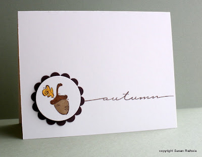
I love this little acorn. I think its jaunty dots and feathery looking leaf make the image so appealing to me. It's a HAPPY acorn. The sentiment is, I think, too big for the card, and a smaller script autumn would make for better balance. The scallop circle is just a bit too far left, don't you think? I tried scooting it a bit more right but then autumn was squished. A possible fix would be to put the same design on a long, thin card, rather than the standard to make the proportions work out better.

If you like the images, the colors, and such on these two cards, the design flaws might not bother you at all. I see cards all the time on blogs that have design flaws but, for whatever reason, I simply ADORE them anyway. There's just no accounting for taste, is there?

Monday, August 17, 2009

A few months ago...

I made these cards while trying to use all the stamps in PTI's Fruitful set. It's a very fun set to work with (except the pears, which you can read about HERE).


This strawberry card would be better if I had just stamped the big strawberry on the card rather than cut it out and glue it. But I cut it out, by golly, and it was getting USED. This would make a great card to mass-produce for gift sets, don't you think? It's a pain cutting out that little strawberry, though, so maybe not, if you're lazy like I am.


An apple a day keeps the doctor away. And aren't you impressed with my rockin' and rollin'? Sometimes that technique just doesn't work for me, but this time, well, it ROCKS.


This may be the first time I've used a scalloped shape for my favorite white-on-white layering. Can't remember. But it's so pretty and screamed for a few embossed lines and a bit of bling.

Thanks for visiting!

Saturday, August 15, 2009

Internet Burn-Out and Asking for a Volunteer

After five days of not exactly keeping up with my Google Reader while visiting my sister and spending most of my time with my hands on her baby bump feeling little Grady kick, you might say my Reader was congested. I have completely cleaned it out by looking at hundreds of posts. Usually, it takes me about 20-30 minutes a day to blitz through the numerous blogs I subscribe to, and it's jolly good FUN. I comment when I can and feel really good about it--you know, it's totally inspiring and peps up gray mornings and generally gives me a warm glow of sheer joy to see other people's work, to read other people's words.

Right now, I'm just glad it's the weekend and most people don't post.

I don't even have a single card favorited for this week's favorites thread, either. I feel horribly guilty about this. WHY? No one pays me to do it; I do it out of love for Clean and Simple and a desire to give cyber-kudos to people whose work inspires me. I'm all about sharing the love, folks, and hope you know this about me.

But today, I'm gonna ask someone else to start that thread tomorrow while I take a little vacation for a few days. I'm gonna stamp, relax, refresh myself. 'Cause you all know how much I love you, love CAS, love bein' out here in Internet Land.

Does anyone else hit these slumps of internet burn-out? And who wants to start the CAS favorites thread at SCS this week? First to volunteer and leave their SCS screen name gets the job!

Friday, August 14, 2009

New CAS Design Team Call

For today's cards, scroll down.

Jen has posted the new CAS Design Team challenge on SCS. I can't wait to see what everyone comes up with. Helping choose the last team was sooo HARD, and I'm sure this will be equally hard. There's so much CAS gorgeousness out there!

If you're waffling about applying, I encourage you to give it a try. The three challenges Jen has set up are all wonderful (that sketch card inspiration by Kerri is drop-dead gorgeous!), and even though only three people will be chosen for the team, I'll bet everyone will have fun playing along!

Inspired by Alli Miles

These cards were inspired by Alli Miles' thank you card in Papercrafts Sept/Oct issue on page 54. Hers is a white OLC with brown branch and circles. I added the scalloped border, changed the base from white to kraft, and made Christmas cards. In retrospect, it would have been fun to pop a few of the circles, don't you think?


Although I originally set out for a more straightforward CASE of Alli's OLC layout, I accidentally used the Take a Bough branch rather than the smaller Out on a Limb branch that she used. Plus, I stamped it too high up on the card, so there was this heavy branch and larger circles at the top and all this awkward, empty space at the bottom. Totally unbalanced. The scallops seemed a good solution to that problem, and I really like how they turned out, so I did another in kraft and white. Not sure which I like best!


Supplies
stamps: all PTI; Take a Bough branch, sentiments from Take a Bough (red) and Merry and Bright (white)
paper: PTI kraft, white; SU real red
ink: SU chocolate chip, real red, white craft
accessories: circle punches, scallop border punch, white embossing powder

Thursday, August 13, 2009

More Christmas Text Cards

These two cards are wonderfully straightforward. I made the focal points by stamping the Christmas text on scrap cardstock and punching/cutting holiday shapes. The hanger for the ornament card was cut freehand from an SU scalloped oval in real red, and its string is a gold marker line drawn with a ruler.


The tree trunks were punched with a slot punch I bought at Joann's, and I cut the trees with a craft knife and quilting ruler.


Both of these cards would be easy to mass-produce and to modify using other holiday background stamps, such as holly, swirls, and snowflakes. I challenge you to improvise, working only with what you already have, to make similar cards. If you feel like it, link to your gallery/blog when you're through so we can see what you've done with this extremely simple idea!

Supplies
stamps: text stamp (unknown)
ink: real red, hunter green
paper: PTI white, SU real red, hunter green
accessories: dimensionals, scallop oval punch, craft knife and quilting ruler, gold metallic pen

Wednesday, August 12, 2009

Fruitful Silliness (edited)


There's a story behind this card. If you like pear images, don't read this post. You have been warned.

I'm not a fan of pear stamps. I know, what is WRONG with me? When I first started stamping, I was on dial-up and had no patience for looking up inspiration online. The only stamp magazines the Borders in Rapid City carried were Stampington's first (whatever it was/is called), Rubber Stamper, and Rubberstamp Madness. After a year of soaking up each issue, I developed a deep and abiding dislike for four things: the color brown, paper doll images, jesters, and pears. Those of you who prefer crisp, clean cards know exactly what I'm talkin' about, don't you?

If you really love pears and don't want anything to interfere with that love, REALLY don't read this paragraph. Just skip to the next paragraph. In medieval literature, pears symbolize the male anatomy. Yep, every time I see a pear image, I see, well, you know.... StampinUp has a particularly disturbing pear on page 113 in its current catalog. If you own that catty, shall I wait until you have looked it up so you can be disturbed, too?

Are you back yet? Okay. English majors have really dirty minds. You can read more about my dirty English-major mind HERE if you want. Or not.

When I bought Papertrey's Fruitful set, it definitely wasn't for the pears. It was for the citrus slices. And the berries. And the grape clusters. And the peaches. I can control my thoughts with these fruits. Most of the time.

So as I challenged myself to use every stamp in that set on a card, I left the pears for last. I used the big pear on an okay card just to say I had used it. It's stamped on a punched circle and if you're reading this, you might guess where that visual prompted my brain to go....

All that remained was the little pear. After banging my head on my table for a few minutes, I decided to make a VERY untraditional pear card. Of course, I like right angles and almost never deliberately make stuff crooked, but when I realized this particular sentiment (from Hero Arts) fit inside the square, I just had to make those rainbow pears laugh and giggle.

I hope you're laughing and giggling, too. Otherwise, you're trying to find me so you can pummel me with a bushel of pears for forever ruining them for you.

I'm sorry.

Supplies
cardstock: PTI white
stamps: PTI Fruitful, Hero Arts sentiment
ink: SU classic bold brights
accessories: dimensionals, square punch

Sunday, August 9, 2009

Lucky 13 is a winner!!!!

The lucky winner (number generated by Random.org) is #13, Harriet Skelly!

Harriet Skelly said...
What's not to love about CAS? Like Ann said I like the WOW factor you can achieve with Less is More! I am so happy that you stood up and started the CAS revolution!Congrats on the 10K hits!! You are the CAS queen seriously - I look up to you and your creations! Hugs, Harriet
August 5, 2009 12:36 PM


Thanks, Harriet, for your kind words. Email me your information and I will get your goodies out to you ASAP...which will be Wednesday as I'm in Maryland and those pretty flowers are in Ohio.

Note to Wendy, who won the eyelets...my email isn't sending from here (though I am receiveing), so know that I did receive your email and will be mailing out your eyelets on Wednesday as well.

And many, many thanks to all of you for your wonderful support of Simplicity!

Saturday, August 8, 2009

Two Subtle Christmas Cards

Yesterday's post was a subtle Thanksgiving card, and today I have two subtle Christmas cards.


These two cards are super simple and easy to mass produce. The first shows nontraditional Christmas colors and some very sweet sheer-and-satin ribbon I bought at Michael's. The second is a tad more traditional, using light shades of green and a white on white layout.

Hope you like the cards and are enjoying your weekend. I sure am...I'm visiting my sister, niece, and nephew on the east coast!

Supplies
Pink Card
stamps: Snow Swirled
paper: PTI white
ink: Versacolor pixie pink, SU close to cocoa
accessories: ribbon

Green Card
stamps: Sleigh Bells Ring, sentiment from a PTI set whose name escapes me
paper: PTI white
ink: Versacolor sage, close to cocoa
accessories: dimensionals, ribbon

Thursday, August 6, 2009

An Oldie I Never Tire of...

and I hope you don't tire of it either because, boy howdy, I will use it again. And again. And again.


This very basic, clean grid layout is so, so perfect. You can make it bright and cheery, soft and calming, crisp or distressed, well, you get the picture. It just always works. Four squares in a grid, with a sentiment underneath. That's it.

Who said safe was boring? Not me.

This card came to me in a rare moment of blinding inspiration. I'd been working with eye-watering colors for days and reached for this set from PTI. After making a few extremely forgettable cards with it, this card popped into my noggin and I just made it.

Don't we all wish this happened more often?

Soft, sweet, (dare I say...oh, why not!) sophisticated. It seriously looks better in real life. I love fall, with its sense of hunking down for the winter and savoring life's blessings. There's a peace and calm to that, amidst all the bustle of harvest. I wanted to show that peace.

The inks are chalk (various shades of Versamagic). I stamped onto PTI's vintage cream cardstock, punched with a square punch, stamped a sentiment, popped up the squares, and THAT WAS IT. Well, it did get a tiny bit complicated achieving an overall balanced look with the four different images and colors, but still.

For one wild and crazy moment, I wondered how bling would look on it, but quickly recovered my senses. It's done. It's lovely. I'm so very happy.

Click on over to my other blog for a few words that reinforce the message of this card. I guarantee it'll make you feel good. *wink*

Supplies
stamps: PTI
paper: PTI
inks: versamagic
accessories: dimensionals, square punch

Another CAS24 Card and a Question for You


When this CAS24 color challenge was first posted, I thought, "This is gonna hurt my eyes." Then I thought, "Hey, waitaminute! These colors popped on a white base would be FAB!" So I made the two cards here. And then I made the card above, 'cause I just loved the sparing use of these really strong colors on white SO MUCH...and I had brads in all three colors.

I love punches. And brads.

Anywho, the point behind this post is that when we push ourselves creatively to do things that might make us uncomfortable (like using these three colors together...on one small card...when they are SO VERY BRIGHT), beautiful things can happen. Of course, sometimes sheer ugliness happens, too.

Which leads me to my question for you today. Would you like to see occasional disasters on this blog? Would it help you to see the cards I DON'T want to share with you? 'Cause that would make me really uncomfortable to let all the world see my failures. But I learn from my failures, and they might come in handy for other crafters, too.

Plus, I'll never actually HEAR your mocking laughter since this is the internet.

I love the internet.

Edited to add: Amy asked how I handled the brad butts. These flowers are attached to the base with glue dots. The brads only go through the flowers, and I adjust each of the tines to hide behind a petal (needle-nose pliers help with this). This way, there are no worries about brad butts on the inside of the card.

We have an Eyelet Winner!

"Wendy (lorenzwm) said...
Eyelets to give away??!! Thanks! Count me in! Love your cards, especially the two recent posts with the heart/quilting and the racoon,...so cute! Your work is beautiful, your simplistic approach has inspired me!
August 5, 2009 7:58 AM"


Well, thanks, Wendy, for the kind words! You are the lucky winner of the eyelet give-away! Send me your address via email (click here for a link), and I'll get it out to you as soon as I can.

For the next five days, things may be a bit quiet on my blogs. I'm going to visit my sister, niece, and nephew, and while I plan on taking my laptop, I'll not be on it as much as usual. Everyone have a great weekend!

Wednesday, August 5, 2009

Over 10,000 Hits!!!!

I. Cannot. Believe. It.

Over 10,000 hits in less than six months? At least I think it's less than six months. My coffee has not kicked in yet this morning, but there it is, staring me in the face: 10,027. YOU PEOPLE ROCK!!!!

I love you all. You know that, don't you?

So here is another craft room purge give-away I know you will swoon over, and when you come back to consciousness, you will sit there scratching your heads wondering why the HECK I'm giving these yummy goodies away in a purge. Well, two reasons. First, I love you. Second, I am Big-Flower Challenged.


Every card I make with these Prima lovelies leaves me feeling disappointed. I tried so hard to make them work for me. Ann makes them work on her cards all the time. I tried copying her stuff. No joy. I studied photos in magazines, cards on SCS, cards on other blogs. I just can't do it anymore. Sometimes, we must retreat in creative defeat.

I feel really good about this. You should, too.

But WAIT! That's not all!

The winner will also receive a $25 gift certificate from Papertrey Ink. Woohooo! For those of you living outside the US of A, that might cover shipping on your order, thus removing the single biggest barrier you have to PTI's goodness and beauty.

All you have to do is tell me what you love about clean-and-simple design in the comments for this post before midnight, EDST, Saturday, August 8. The winner will be chosen at random and announced on this blog sometime next week.

Thank you. Thank you all.


Tuesday, August 4, 2009

Want Eyelets?

This is my second post today. If you want to see cards, please scroll down to today's earlier post.

In my never-ending quest for a perfectly organized craft space, I try to purge supplies that I will never use. Some of this stuff is in the category of "so cheap why the heck did I buy it in the first place" and other stuff is the category of "great stuff but doesn't work for me." I decided stuff in the second category might find a happy home with a reader of my blog.

I have about a thousand eyelets that I will never use in a wide range of colors. These are mostly standard eyelets from a variety of sources, with a few snaps thrown in for good measure. Instead of giving these to GoodWill, however, I figured if one of my kind readers WANTED eyelets, well, by golly, she can have them.

Leave a comment on this post telling me why you would be happy to receive a bunch of eyelets in the mail, and I'll have a random drawing after 6:00 PM EDST on Wednesday, August 5th to choose a winner.

Any takers?

Edited to add photo....


More CAS26

This week's CAS26 challenge made me very happy. I loathe, despise, and generally hate sewing, mainly because I'm really bad at it and don't have the patience to learn to do it well like my mom, who is a fine artist (watercolor, pastels, oil) and textile artist. She kept all those creative genes for herself, thank you very much.

My creative gene, which I have nurtured for the past eight years, likes paper...and rubber...and ink. When I found that I could rubber stamp art, I did a happy dance. Mom doesn't understand why I would buy stamps when the images are so easy to draw. I'm rolling my eyes right now. She totally doesn't get it.

So a few years ago, when I found a stitch stamp set called Hemlines from Paper Salon, I snatched that bad baby up. And bad baby it is. I think PS is out of business now, and I so understand why. They sold UM rubber with a totally terrible backing that barely clings to anything. (It's not EZ-mount...not sure what it is.)

Anywho, I rarely use these stamps but this week's challenge sang to me because I DIDN'T HAVE TO SEW...I COULD STAMP! Here are a couple more cards I made. Hope you like them...'cause I sure do.


The above card happened because the cross stitch row stamp was right next to the row of circles in my storage tin, and I thought...x's and o's, hugs and kisses, OH MY GOSH. That works perfectly with this sentiment from PTI's Quilter's Sampler set, which I bought so I could make quilt cards for mom and my MIL and my aunt...all of whom quilt. It took two tries to get the border in the right place, but it was worth the wasted paper, don't you think?


This raccoon stamp comes from Hero Arts. You'll notice it's an outline stamp (don't see those often on this blog, do ya?). Yes, I had to COLOR IT IN with colored pencils and a blender pencil. Just because I have most coloring tools known to papercraft kind doesn't mean I can USE them, if you know what I mean, so I looked up the stamp set in the Hero catalog and tried to copy what was in the picture there. It turned out okay, I think, especially for me. But don't ask where the light is coming from. He's cute anyway, don't you think?

I'm an abstract colorer. Yeah, that's it. Why should light only come from one direction? Why follow the rules?

Oh, bother.

Monday, August 3, 2009

CAS26 Stitching

I got so excited last night when I checked on CAS26 and discovered it was stitching but had NO IDEA what I would do except use my Paper Salon stitch stamp set. I perused my stamp index notebook to see what popped out at me and stumbled across Quilter's Sampler by PTI and had an AHA! moment. Here's the result.


It's wonderfully straightforward. I used the wavy double line to hint at a nice, healthy, steady heart beat on a monitor. The button is there 'cause it's pretty. The sentiment was stamped twice and masked for the two colors, but really, I could have colored with both colors and stamped once because I used dew drop pads, which are so easy to control.

Thanks, Jen, for a great challenge. I'm totally not done with it yet....

Supplies
stamps: Paper Salon, PTI
paper: PTI
ink: chalk
accessories: button, ribbon, glue dots

Sunday, August 2, 2009

J O Y


While under the inspirational influence of the PaperCrafts article "Graphically Speaking," I made this Christmas card, which would be super easy to mass produce. Placement of the letters is a snap if you have a large gridded acrylic block and can stamp all three letters at the same time. This card isn't a standard height...not sure how short it is, 'cause I eyeballed it to make the word and gems feel balanced. I wanted to leave it as a white-base OLC, but it really was too plain, so I scalloped the bottom and added a red border, which helped spruce it up without being fussy.

Hope you like it!

Supplies
stamps: Hero Arts alphabet
paper: PTI white, SU real red
ink: real red
accessories: Hero Arts rhinestones, SU scallop border punch

Saturday, August 1, 2009

A Card that Makes Me Happy!


Oh, my! This card snapped me out of a mojo funk on Tuesday when I was trying to come up with something for the CAS25 challenge. I'd made three or four cards that were very, very forgettable when this one popped out. It's sufficiently different from the challenge sketch that I didn't upload it to that gallery (and besides, my cards that I finally did load to that gallery also made me really happy). But still, this one is worthy of note.

It's a 4.25-inch square card that uses a Hero Arts clear stamp set. Usually, I'm highly bothered by grammar errors on stamps (there should be a comma bewteen "hello" and "friend") but I'll let this one slide. This is such a harmonious card, perfect for sending to a friend who is stressing out.

Supplies
stamps: Hero Arts
cardstock: PTI white
ink: Palette chocolate, SU always artichoke, old olive markers
accessories: dimensionals, "cloud" deco scissors, Hero Arts olive rhinestones, ribbon