Thursday, May 31, 2012

Delusions of Grandeur

Did I spell that correctly? Grandeur? It doesn't look right. I'm a visual speller who is far too tired to pull out her magnifying glass and Volume One of the two-volume, tiny-print Oxford English Dictionary tonight. (If you don't have one, get one. It's way better than electronic spell checkers.)

You see, I spent all day dealing with my boys who, at 12 and 9, seem to think it's okay to call each other idiots and liars and jerks. Refereeing is exhausting.

It was the first day of summer break.

Just 84 more days until school starts.

I need coffee. Lots of coffee. And chocolate. Oh, yes. Chocolate. Noise-cancelling earphones would be nice, too.

Anyway, back to grandeur, or delusions thereof. You see, when I made today's cards, I "discovered" a neat trick with using PTI's first Polka Dot background set. It's laid out so you can stamp TWO colors by stamping it twice. Like this vision of fun in pink and orange.


Or this, if you prefer your colors greener and bluer.


This set has been out for a couple of years at least. I bought it shortly after it was available. And when I discovered this AMAZINGLY COOL TRICK earlier this week, I felt like the smartest stamper on the planet.

But I know that's not true. Others have definitely noticed how easy it is to two-step stamp with this set. But the giggling with glee I did a few days ago must be shared.


I. Totally. Rock.

See? Delusions of grandeur on a Thursday night.


Have you ever experienced delusions of grandeur? Care to share? Please do.

Supplies
stamps: Papertrey Ink Birthday Basics, Polka Dot
ink: Memento pink and orange; SU turquoise and green galore
paper: PTI white
accessories: ribbon, Scor-Tape

Wednesday, May 30, 2012

Inspired by Christina MacLaren

It's been a long time since a magazine inspired me as much as Card Creations Volume 10 has. There's just so much goodness hitting me at just the right time and when I'm in just the right mood, I guess.

Today's inspiration comes from Christina MacLaren, whose black-based card with white embossing totally grabbed my attention. The way all the images fall off the left side of the card really appealed to me.


I decided to pull out some StampinUp and Hero Arts office-supply images and play. Here's what I came up with:


How fun is this?!?!? You know I had to use a white base because I'm me, but I kept Christina's color scheme of white, black, and red...just changed the proportions. Using the white background allowed me to create a visual triangle of red, which helps unify the card nicely. Christina's card doesn't have a unity problem like my version because she uses the strip of white card stock to create a clear focal point, and the background images support her card's sentiment perfectly. My card doesn't have that clear focal point (unusual for me, I know), so some other aspect of the design has to fill in to bring the main message into focus.

The calendar (from a Hero Arts stamp) is positioned so that I can circle the birth date of whatever person receives this card. I'd originally planned on using a red pen for that, but then decided to make the Happy red instead, since that pulled the sentiment into the design so much better.

I hope my design blatherings make sense.

Anyway, this card makes me happy, and I hope it has the same effect on you!

Tuesday, May 29, 2012

One-Layer Wednesday #90: Dudes Rule

This week's OLW is to make a one-layer card for a man in your life. Of course it could be a Father's Day card, but really, whatever theme you choose, you just need to make it for a guy.

My card is for my hubs for Father's Day. He served 20 years in the Air Force (thus the military theme) and retired because he didn't want to deploy for year away from his sons, especially the one with autism. He'd already deployed several times and just couldn't bear to miss more of their childhoods. Walking away from a career he loved for his sons...he's my hero. And that's why I stamped "you're my hero" inside this!


OLW90 Rules

1. A one-layer card is defined as a single layer of card stock folded in half. No other layers allowed.

2. Make a card for a man...and tell us who it is! Please keep embellishments to a minimum.

3. Post your card somewhere online and link to it using the InLinkz button on the sidebar. If you post on your blog, please link to the individual post, not to the main page of your blog.

4. The most important rule of all is TO HAVE FUN!!!!!

Supplies
stamps: Hero Arts (sentiment), StampinUp (stars)
ink: Memento
paper: PTI natural
accessories: none

Monday, May 28, 2012

Memorial Day


I will remember. Always.

To read a Memorial Day tribute from a Navy veteran, please visit my other blog here.

Have a safe and meaningful holiday!


Supplies
stamps: StampinUp
ink: Memento
paper: PTI
accessories: half pearls, stamp positioner


Friday, May 25, 2012

OLW89...Three Cards

So I didn't get to stamp yesterday because I was too busy being obsessive about my new house. Seems that the only thing holding me back from going all AR/OC about getting settled in the new place was the fact that we'd not sold the old one.

Now that we only own one house, the dam has broken and I'm surging forward with a vengeance that has left me crippled and limping. Because, you know, I can't do something sensibly slow and easy. I've got to either laze about thinking "oh there's just too much to do so I'm not going to do any of it" or "I am the Energizer Bunny on SPEEEEEEEEED look at me GOOOOOOOOO!!!!!!!!!!!!!!!!!!!!!"

You think I'm kidding? Then you don't know me. It's sort of scary, actually, how stupid I can be.

Today is "stay off my feet as much as possible day." So of course I stamped. Three cards for OLW89: Something Sweet.

PTI's Fruitful came immediately to mind. Fruit is sweet. And yummy. So let's start with grapes for a thank you note:


Suitably simple and just my style, right? So now let's mix things up with a technique. I colored the peach stamp with SU pretty in pink and pumpkin pie markers (pink first, pumpkin over that) and spritzed with Shimmer Mist. The photo editing made the color more intensely orange than it is in real life, but you get the picture.


Finally, well, let's just say I can only give this card to my husband. If you don't know why, read this.


The watercolor effect comes from Memento pear tart marker under rhubarb.

And that's all I have to say about that.

If you haven't played the OLW this week, click on over to Cheryl's blog and do so! It's a sweet challenge!

Wednesday, May 23, 2012

Finding My Mojo with Jaclyn Miller

Before we get to my mojo, don't forget to check out OLW89 on Cheryl's Blog: Something Sweet. Make a one-layer card with something sweet on it. Her sample is fabulously inspiring, and I'm going to make time tomorrow to play along!!!!


And now on to my mojo.

Oh, I'm having so much fun with Card Creations Volume 10! Today's inspiration comes from Jaclyn Miller and her absolutely delightfully "me" baby card:


Can't you just imagine I would make a card like this? Check out all that glorious white space! Check out that fun color combo! Check out the SINGLE LAYER OF CARD STOCK!!!!!!!!!

Of course, I can't remember ever having the brain bliss to do something like this, so I took her brilliant idea and looked for stamps in my collection that would work similarly. And I made this in about five minutes (and that includes searching for the stamps):


Squeee!!!!!

Sometimes, when we improvise, we have to tweek things to keep the design balanced. Since my sentiment was a bit wider and the red image a bit bigger than Jaclyn's, I moved it down on the card. That just felt right for balance. Higher, it would have looked top-heavy. Lower down, it feels grounded.

Thank you, Jaclyn, for opening up a whole glorious new CAS layout for me. I anticipate using this one with every single long sentiment I own. The permutations are endless!


Supplies
stamps: Papertrey Ink Floral Frenzy
ink: Memento pear tart, black; SU real red (because it's the only real red out there!)
paper: Papertrey
accessories: not a single one!


A Question and Request for You

Reader Brend is having a weird experience on Simplicity, and I hope one of you can help. She's getting text enhancement on certain words...you know, when her cursor hovers over them, she gets ad links. Is anyone else experiencing this? Does anyone know what's causing it? I don't get any text enhancement, so we suspect it might be a virus on her computer or some setting in her browser. Any help getting rid of this annoying feature would be greatly appreciated!

Please know that if I ever add advertising to Simplicity, it will be the "bottom of the post, non-blinky" kind. DH is mad that I have so many hits and no money to show for them, LOL!

Also, Reader Leslie had a problem commenting on a post on my other blog. If you ever have a problem commenting on any of my blogs, please pretty please let me know.

Tuesday, May 22, 2012

Finding My Mojo with Els Brige

As we continue this week's walk down inspiration lane, we're going to take a look at a fabulously wonderful card by Els Brige.

Will someone please tell me how to make an accent over the e in her name so I can spell it correctly?

Anyway, here is Els' stunningly loose and artistic card from page 24 of Card Creations Volume 10:


Now, if you've been reading Simplicity for any length of time, you know how, um, TIDY my cards tend to be. I love Els' looser style, the splatter background, and the free-form stitching on her card, but I'm uptight and hopelessly in love with right angles.

So here's the best I could do...and I like it muchly!


My splatter background is an old stamp I bought at JoAnn's. I was going to soften the edges of it with the SU Itty Bitty Background splatter stamp, but when I made my strips of paper ('cause I'm allergic to designer paper, remember?), they looked so graphic and geometric that I sorta liked the straight edges of the splattered area. I'm not convinced it's a successful experiment from a design standpoint, but that's really not the point.

And only one element is askew. Ask me how hard that was to glue down.

So hard!

Color totally changes the feel of Els' layout, doesn't it? Hers is warm and soft in browns, black, tan, and white. Mine is fun and funky in pear tart and bahama blue.

I hope this post demonstrates one key element of inspiration: having fun. In the end, I like Els' card WAY better than mine. But playing with her layout really sparked my imagination and sense of my own style again.

I sincerely hope that a few of my cards have that effect on you.

Supplies
stamps: Hero Arts grid background; Papertrey Background Basics: Circles, Faux Ribbon; Unknown spatter
ink: Memento
paper: Papertrey white
accessories: flower punch, rhinestone


Monday, May 21, 2012

Finding My Mojo Again: Inspired by Card Creations and Emily Leiphart

Lately, I've sat down too often in my (still unfinished) craft space and felt...unmotivated?...uninspired?...distracted?...pointlessly wallowing in crafty malaise? Whatever I've been feeling, it's not been fun.

Heather's OLW challenge certainly got me going, but after I made those three cards, I sorta lost steam again. So I picked up Card Creations Volume 10 from Papercrafts Magazine.

OHMYGOSHOHMYGOSHOHMYGOSH!!!!!!!!!!!!!

So for the next few days, I'm going to share cards that came out of a VERY fruitful two hours on Sunday. First up is one inspired by the very talented Emily Leiphart. Hi, Emily!!!!


I loved her use of curves and lines but don't have the dies she used to make this. Sooooo, I pulled out my punches. My version is smaller...using a 3/4" square punch and a 1 1/4" circle punch, which I then trimmed a bit.


I also used just four SU colors of card stock, because Emily may be comfy using seven colors, but I am not. Four colors make me itch...seven would give me a major case of hives!
If you look closely, you'll notice the bottom right square is just a bit off. This is what happens when you glue something down wrong. And the glue doesn't move after just a few seconds. Darn. Oh, well. At least someone will know it is handmade, and therefore special!

No matter. This was INCREDIBLY FUN to make, definitely fresh and definitely enough to jump-start my enthusiasm again. Thank you, Emily, for doing that for me. Mwah!


Supplies
stamps: Papertrey Sign Language
paper: SU marina mist, baja breeze, certainly celery, cool caribbean; PTI white
ink: SU marina mist
accessories: square punch, circle punch, scissors, Corner Chomper

Sunday, May 20, 2012

A Quicky

Here's a quick card for a wiped-out Sunday night.


Bit of an unusual layout. What do you think?

Hope you all had a lovely weekend. Mine did not involve quite enough sleep, but lots of reading and a bit too much baseball.

Supplies
stamps: Papertrey All Booked Up, Faux Ribbon
ink: Memento (including the new teal!)
paper: PTI white
accessories: Memento Marker

Friday, May 18, 2012

OLW88 Final Card?

Probably not. Because, really, this challenge is timeless. Eternal. Perfectly CAS. And I love it. Excessively.


I colored an old Hero Arts shadow stamp with Memento Markers and spritzed it with Tattered Angels Glimmer Mist (the glimmery colorless one). The photo doesn't show the shimmery goodness of the background. Then, I stamped the grass from some PTI set whose name escapes me...Peaceful Garden, maybe? I don't know and am feeling far too lazy tired to go look. Anyway, the grass fit perfectly, and bling just makes it better!

Have a lovely weekend, everyone!

Supplies
stamps: Papertrey, Hero Arts
ink: Memento
Paper: PTI
accessories: Glimmer Mist, rhinestones

Thursday, May 17, 2012

OLW88 Koi Strikes Again

This koi is one of the most brilliant stamps ever.

Hyperbole is fun, and sometimes, it's true.


I used the Hero Arts Wood background stamp through a 1.75" square mask punched out of a post-it. Then, leaving the mask in place, I sponged a bit of the same color ink (Ancient Page Neptune) to fill in the water. After removing the mask, I stamped the koi just ever so slightly falling out of the lines of the square. The sentiment tucks right into the koi and hangs off the edge a bit as well. This may mean it doesn't qualify for the challenge exactly, but it's pretty darn close!

Supplies
stamps: Papertrey Masculine Motifs, Hero Arts wood background
ink: Ancient Page Neptune, SU pumpkin pie, Memento Gray Flannel
paper: white
accessories: square punch, post-it, sponge

Wednesday, May 16, 2012

OLW88...I'm HUGELY Inspired

Heather always inspires me to pull out my sponges, but for some reason, my sponges were not playing nicely this week. So I decided to flex to completely different styles that still meet the requirements of the challenge, which is to make a mini masterpiece, keeping your stamped area to no more than 2" x 2". No worries there...just think of all that glorious white space!

I've made a whole bunch of cards I'll share over the next few days. That mini-masterpiece idea is just so gosh-darn fun!
First up, I pulled out Grunge Me from Papertrey Ink and played. My first few efforts were, shall we say, unbalanced in the color department, but then I hit on these two color combos and giggled with glee!


I love the fresh and loose feel of Grunge Me...it makes me think I'm not quite as obsessive as I feel most of the time.

Don't forget to play OLW88...Heather is offering a prize from Penny Black of the gorgeous stamps she used on her card.

OLW88 Hosted by Heather Telford!

Don't forget to click over to Heather's blog for this week's OLW challenge! It's right up Heather's alley and will have me breaking out my sponges today. Oh, goodie!!!!!

Tuesday, May 15, 2012

CASification Inspired by Glenda Wyatt

When I saw the card by Glenda Wyatt in the latest special issue from Papercrafts Magazine, I squealed in delight and made my son ask, "Wha'?" He didn't get it, but you will:


Of course, Glenda's brilliant use of TOOTHPICKS to make a GRID for an adorable patterned-paper flower made me squeal, and while it's already CAS (check out all that glorious white space!), I decided to use my Hero Arts Envelope Pattern background to make a flatter version of Glenda's card.


I masked an area of the card and then stamped the Envelope Pattern at an angle, so the pattern would be horizontal/vertical rather than diagonal. Clever, eh? Then, after unsuccessfully experimenting with my flower punches and really wishing I had a die cut machine and an infinite number of dies, I thought about Papertrey's Beautiful Blooms, with this totally fab and timeless daisy stamp.

YAY!!!!!

It's not as awesomely creative as Glenda's original, and I had to move my sentiment onto the grid because the flower wasn't quite large enough for the grid area I stamped, but it's a bit more mailable (even with the button) and it gave me a chance to use SU's Cherry Cobbler, which is completely wonderful.

Supplies
stamps: Papertrey Ink (Beautiful Blooms), Hero Arts (Envelope Pattern), SU (sentiment)
ink: SU pretty in pink, cherry cobbler (yummy!)
paper: PTI white
accessories: button, glue dot, craft thread, post-its for masking

Monday, May 14, 2012

Winterberry in a Single Layer

...with bling, of course.


Not much chit-chat today. I'm off to my craft area to make some new stuff...because this is the last card on my hard drive I've not posted!

Blessings to you, and thanks for your readership!

Supplies
stamps: Winterberry (PTI)
ink: Memento bamboo, SU real red
paper: PTI white
accessories: rhinestones, corner chomper

Sunday, May 13, 2012

Geezer Explained and a Yellow Card

In my last post, I referred to my husband as a geezer at 47 years old. This is a bit of a running joke since I've referred to him as a geezer since our early twenties. You see, he's ALWAYS going to be older than I am. So no matter how old I feel, he's older. And this makes me feel good.

He can tease me about my gray hair, and I can counter with teasing about his baldness: "At least I HAVE hair!" But that just evens the score.

He will never be able to counter the age thing, so I WIN. We laugh a lot in this house. And exaggerate. As I've grown older, I now believe that people all people except my husband need to be at least 90 to be geezers. When I'm 80 (God willing), I'm sure I'll bump geezer age up to 100. But George is a geezer right now and has been for twenty-plus years.

And now for a yellow card.


Design Discussion: Nothing cosmic, but it's pretty, no? I actually tried a black mat under the stamped panel and did NOT like it, which totally surprised me. It would seem that a touch more black would unify the design, but it made it look really heavy and off. I suspect if I had a dark gray ink and paper, a mat would have worked great. Sometimes, black is just too stark.

The yellow card stock is from Gina K and is my favorite yellow card stock ever. It's really yellow without being too yellow, if you know what I mean.


Supplies
stamps: A Muse (flowers), SU (sentiment)
ink: honestly can't remember the yellow; Memento black
paper: Gina K yellow, PTI white
accessories: yellow pearls, dimensionals

Saturday, May 12, 2012

Today's Friday, Right?

Oh, wait. It's Saturday. And I forgot to post yesterday. Hmmm.

Today is my husband's birthday, and here's the card I made for him. Dude cards are always so hard, and I think I like this way more than he does. But still, it's cool, isn't it?


I told him the gold was for his Golden Years. He's 47. The geezer will always be older than I am!


Hope you are having a great weekend.

Supplies
stamps: Papertrey (Masculine Motifs)
ink: Memento (with off-stamping)
paper: PTI natural
accessories: gold smooch, dimensional, sponge

Thursday, May 10, 2012

More Smooching!

Here's the card I made for my husband to give his mother for Mother's Day. I used yesterday's Smooch technique with Botanical Silhouettes, one of the anniversary sets from Papertrey and perfect for smooching!


Here's a close-up so you can see the shimmer. The green on this card shows up darker than in real life...getting the color balance right in Picasa is sometimes beyond me!


I used LuLu Lavender and Pear Tart Memento inks, and light purple and lime Smooch...good color combos for this technique.

On another subject, Super Jen asked what I do with all the cards I make. Well, I send a lot of them to friends, family, and random people I meet on the internet; and I give gift sets to friends and family who ask for them. Most of my cards, however, go to the troops overseas so they have cards to send home to their families and friends.

My husband served 20 years in the US Air Force and deployed several times. Our armed service personnel--and their families--are near and dear to my heart.

There was an interesting thread on Splitcoast recently discussing whether or not we need to produce "useful" things. Is the act of creation sufficient reason to do what we do, or should there be an end-user for our art/craft products?

I'm extremely ambivalent on this issue and truly feel every artist/crafter ought to do what makes her/him happy. I don't like to think of making cards that won't be used because I'm practical that way, but when all the troops come home, who will I send them to? Should I try to sell them? Package them to sell at my church bazaar every fall to benefit the church? Make fewer cards? Shift back to more scrapbooking? Bookbinding?

Ultimately, what matters is that I like making things with my own two hands, ink, and paper. It's therapeutic, makes me happy, and occasionally makes other people happy, too. I'm not going to worry too much about it. Besides, that church bazaar thing sounds pretty good.

But for now, it's the troops who get most of my cards. And that makes me happy.

So what about you? Do you make cards just to make them? Do you send them yourself? Or do you sell or donate them?

Supplies
stamps: PTI Botanical Silhouettes, Faux Ribbon
ink: Memento
paper: PTI
accessories: Smooch, sponge

Wednesday, May 9, 2012

An Easy Technique that Exploits Clear Stamps and Smooch Ink

First of all, don't forget OLW87 on Jennifer's Blog! Hope I can play tomorrow!!!


One great thing about clear stamps is how incredibly easy it is to place them almost exactly where you want them. It's not as precise as I would like, but I experimented with double stamping solid images to get a soft, layered effect, and today's technique doesn't have to be precise. It's actually quite forgiving.

First, let's look at the finished card and matching envelope.


The paper is Fabriano Medioevalis...gorgeous watercolor paper with natural deckled edges. Yum. And don't you love the mottled look of the koi? Creating this look is amazingly easy!

1) First, stamp a solid image in a waterproof ink. I used Memento Tangelo

2) Then, clean the stamp and sponge Smooch (I used Carrot) directly onto the clean stamp. Don't cover the whole image...leave blotches of the ink on the stamp.

3) Re-stamp the image, aligning it as closely as possible to the ink image.

4) Sit back and appreciate your shimmery stamping!

I experimented with lots of color combinations and quickly discovered that some work better than others. (That's one advantage of having lots of bottles of Smooch!) Generally, monochromatic stamping with a lighter shade of ink than the Smooch works great, but gold Smooch on the tangelo looked icky. Silver looked great on light blue, though. Sometimes, light colors of Smooch show up great on darker inks (the lightest pink Smooch and hot pink Memento ink look awesome!) but light blue Smooch disappeared on dark blue Memento. Play around on scrap paper before committing good card stock to whatever combo you want to try.

What do you think? Does it make you want to order a selection of Smooch? *wink*

Supplies
stamps: Papertrey Ink Masculine Motifs
ink: Memento, Smooch
paper: Fabriano
accessories: envelope, sponge, plastic paint tray

OLW87 Think Outside the Box...

is posted on Jennifer's blog! It's a good one!!!!

Think Outside the Box!

Tuesday, May 8, 2012

Cool Stuff from Gay in the UK!

My online friend Gay sent me a package last week...a package that included her absolutely drop-dead gorgeous card for one of the OLW challenges.

Gay's Fabulous Christmas Card

That masking and sponging is divine!!!! Plus, the pine branch is perfectly placed for superb interest and sheer gorgeousness.

She included a pile of die cuts for me to play with, and these are the first cards I made with them.


The intricate frames are soooo pretty, and I knew I wanted to go with something elegant on them. Alas, I don't have a whole lot of elegant stamps, but then I remembered Everyday Blessings from Papertrey, and these came together lickety-split. The card stock is from GinaK...thanks again, Jimmi!

I'm going to have so much fun using the rest of the die cuts...thanks so much, Gay.

Supplies
stamps: Papertrey
ink: Brilliance lavender and purple, Memento black
paper: GinaK
accessories: die cuts, gemstones, glue pen

Monday, May 7, 2012

Masking Big Backgrounds

So. We've looked at three ways to use a large background stamp: 1) as all-over background, 2) as partial background, and 3) for adding interest to punched shapes. A fourth way to use large background stamps is to mask an area and stamp a defined space, such as a border, ground, or sky.

For today's card, I used two large post-it notes to mask off a 5/8" strip on a largish piece of scrap paper. Then, I stamped the background, having only inked part of it (no need to waste ink...but make sure you ink enough to cover the intended area!).


I liked the black-and-white effect of this card, but the card seemed a little blah. So I fell back on my design mantra: Bling Never Hurts.


That's better!

I really like seeing big backgrounds masked to form hills or ground for scenes, too. I've not had a chance to make such a card in a while and hope to use Envelope Pattern that way soon. The cross-hatching would make lovely grass, don't you think?

By the way, I'm running low on these bling flowers and have been hoarding them. Whenever I catch myself "saving" craft supplies, I give myself a stern talking-to:

"Do NOT save stuff. USE it. If you don't use it, one day, you may look at it and wonder why you liked it in the first place. When that happens, you wasted money and opportunity. USE it WHEN you LOVE it. Don't worry. There will always be new things to love. So NO SAVING!!!"

Then, I hang my head in shame and use it. Because I'm right, aren't I?

Supplies
stamps: Hero Arts
paper: PTI white
ink: Memento
accessories: dimensionals, bling flowers

Sunday, May 6, 2012

Punches and Envelope Pattern

Large background stamps can create interesting designs for punching, especially finer ones like Envelope Pattern by Hero Arts.

Flowers are always good for this, well, you can't really call it a technique, but maybe procedure works.

First, stamp the background on scrap paper. For this floral card, I inked it with three different colors using Memento Dew Drop ink pads. Then, punch your flowers (or whatever shape you want) out of the stamped paper. Then, use them as you would any punched shapes.


Bling doesn't hurt.

Of course, this works with any punch, so I decided to use my Fiskar's pumpkin punch, which has separate shapes for the stem and leaf and pumpkin. I inked the stamp with orange and green to create the scrap from which I punched the shapes.


And then I made this card. It looks better in real life...something about the contrast in Picasa made the punch looked washed out and the orange card too intense. But trust me, it's not so bad!


So take a look at your big background stamps and see if any would complement your punches (or dies) nicely. Cupcakes, leaves, and holiday shapes might all be enhanced with fine-detail backgrounds!

Supplies
stamps: PTI Beautiful Blessings (top card), Falling Leaves (bottom card)
ink: Memento

paper: PTI white, SU pumpkin pie
accessories: punches, dimensionals, rhinestones, corner chomper,

Friday, May 4, 2012

More Fun with Envelope Pattern

Thanks for the warm response to Wednesday night's post. My apologies this one is late.

And no, Joyce, I am not kidding about standing on your big stamps. I actually prefer it to the inking-rubber-side-up method because it gets me moving and practicing balance. *snort*

Carol Duvall demonstrated standing on big stamps years ago, at a time when I was horribly frustrated by poor impressions and ruined card stock. My craft room had a carpeted floor, so I took a 12"-square piece of smooth plywood I'd had cut for an improvised book press, and used that to support the card stock. Worked beautifully, and I've done it ever since.

The other method came to my attention via some thread on SCS. It's slightly more time-consuming and can be prone to error if you don't rub the entire stamp well, but otherwise it's just as effective as standing. Someone suggested using a brayer to do the rubbing, which sounds like a great idea.

As for inking large stamps...I've read at SCS that some people use brayers to ink the stamps, but I've never really liked brayers all that much. I ink large stamps by placing them on the table rubber-side-up and holding the pad upside down. I get all obsessive about coverage (does that shock you? you must be new here) and tap the pads over the rubber repeatedly. It takes longer, but the little dew drop pads are easier to ink with than big SU felt pads, which I find sometimes don't give as good coverage for big stamps due to bowing of the felt...even on well-inked pads. I wonder if the new SU pads will work better, but the tiny pads give good control.

Enough chit-chat. Let's get to the card.


Yesterday's card showed the most obvious use of large stamps...all-over backgrounds. Today's card shows how you can use it for part of the background. I inked the stamp and then placed it so it would leave clean space on the right of the scrap of paper.

I should have taken a picture before I added the green hearts. The card didn't look at all unified until those three went down. The green hearts around the sentiment carry the green color over the baker's twine and help relate the two parts of the card. They also make three elements (hearts, envelope pattern, and card base) green. Three is a very good number.

Color is often a major contributor to a card's unity, so if you're working on a design and it's not coming together, think about how repeating color can help.

supplies
stamps: Hero Arts
ink: Memento
paper: Gina K
accessories: baker's twine, dimensionals

Wednesday, May 2, 2012

Finally...It Is MINE!!!!

I have wanted this stamp for, oh, forever. And every time I went to place a Hero order at my favorite, trusted Hero suppliers, it was out of stock. Duh. It's, well, cool.


I finally got lucky on my last order...when there was just one left!

Over the next few days, I'm going to show a variety of uses for small patterned backgrounds like this. We'll start with the most obvious use of a big background stamp...a big background.


This card uses an old sentiment (Stampabilities, I think) that I just love, some turquoise bling flowers that I just love, and a piece of A Muse card stock (thanks, Joan!) that I just love.

Tonight, I'm all about the love, basking in the glow of cool stamp ownership.

Stamping Tip: When using big background stamps, I use one of two methods for getting a good impression. #1) Ink the stamp and place it inky side up on the table. place the card to be stamped on the stamp, cover with a sheet of scrap paper, and use a bone folder to rub over the surface of the stamp. #2) Place the paper to be stamped on a solid floor or piece of good-one-side plywood. Place the inked stamp down on the paper and then stand on the stamp. Works every time.

Supplies
stamps: Stampabilities, Hero Arts
ink: Memento gray, SU cool caribbean
paper: A Muse, no-name white, PTI gray
accessories: dimensionals, gemstone flowers

Tuesday, May 1, 2012

The New One-Layer Wednesday Challenge!!!!

Welcome to the New One-Layer Wednesday Challenge! I am so happy to announce the introduction of two new OLW hosts who will join Jennifer and me. Each woman brings a whole lotta CAS talent to the fun!

First up, Cheryl Emery of The Paperie Journey. She avidly participates in all sorts of challenges, including the CAS challenge on SCS and the Less Is More Challenge. Check out her blog and you'll see she's a fearless stamper, versatile, willing to try anything, and wonderfully talented, too!

Our second new host is the inestimable Heather Telford of Bits & Pieces. I've been a huge fan of Heather's amazing skills with a sponge for years. Her fabulous sense of color and masterful use of white space really define her soft-yet-crisp CAS style.

Jennifer, Cheryl, Heather, and I will alternate hosting the OLW challenge. To make it easier for you to find the challenge each week, I'm going to put a special section on my sidebar with links for the other three blogs, plus I'll announce where the challenge is every Wednesday.

Yippy!!!!!! I hope you find this as exciting as I do!!!!

And now for One-Layer Wednesday #86: Women Rule

In honor of our new hosts, the challenge this week is to make a card for a woman in your life. She may be your mom, of course, with Mother's Day right around the corner, or any other woman who is special to you for any reason.

You'll get a bonus point (good for a cyber-hug!) if you share some little detail about the person that you've incorporated into your card...an inside joke, favorite color, favorite image, etc.

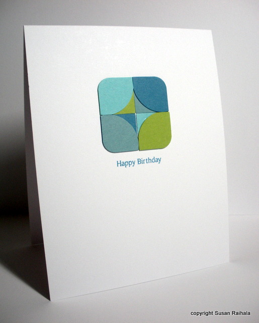
My card is for my sister, Lisa, who has been my best friend since her birth. Well, in truth we drove our mother insane with our bickering, as only two sisters can. Our last fight, however, was in 1983...almost 30 years ago! We started girl-slapping at each other, realized at the same moment how utterly stupid that was, dissolved into laughter, threw our arms around each other, and have been best friends ever since.


The card combines three Papertrey Ink stamp sets: Simply Jane, Stampers Sampler Sentiments, and Silent Night (a Christmas set with that fabulous flourish). The inks are Memento, the paper is PTI, and the corners were rounded with a Corner Chomper.

My Bonus Point: Lisa's favorite color growing up was brown because she felt sorry for it, hence my use of browns on the card.

OLW86 Rules

1. A one-layer card is defined as a single piece of card stock folded in half. NO other layers allowed.

2. Make a card for any woman in your life...mom, sister, BFF, the lady who serves your mocha at Starbucks, whoever. Please keep embellishments to a minimum. As a bonus, please share something about your card that makes it personal for its intended recipient.

3. Upload your creation somewhere on the Internet, and then link to it using the InLinkz button on the sidebar of Simplicity. Please make sure to link directly to the card and not just to your blog so people will be able to find it easily!

4. The most important rule of all, of course, is to HAVE FUN!!!!!